


You've just launched your new website. Here are some simple tips for maintaining website content and getting the most out of your website.

Your website just launched and it is looking quite awesome! All that hard work and effort has finally paid off. Your team is happy with the results, leads are pouring in and the company stakeholders are thrilled. Whether you’re working on Magento, WordPress, or another platform, you’re going to need to think about maintaining website content.
Now you are tasked with adding website content and making updates, but likely you are not a graphic designer who lives by the rules of typography and toils over making each and every paragraph look just perfect on a monitor. So how do you make sure that any updates made to the site keep in line with its overall fresh look?
Know your heading styles and keep consistent.
Your website has a stylesheet where your designer has defined the fonts, color, and size of the headings and paragraphs for your website. It's a good rule of thumb to know these styles and use them consistently when inputting content. Your Heading 1 is usually the page title and maybe you use Heading 2 as the subtitle with Heading 3 for paragraph headers. Asking your designer for a cheat sheet that you can keep handy really helps you keep your content consistent from page to page and will make maintaining website content easier.
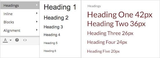
Get a reference for heading styles and use them consistently.
Avoid introducing new font colors.
This tip goes back to the stylesheet referenced above. Before you highlight that text and make it magenta, make sure the color is in line with the overall color palette of the website. Also, changing a font’s color in the editor creates extra code that can not be overridden by a style in the stylesheet. If you suddenly never wanted to see magenta again, you would have to find every single page that had that color and change it – what a drag! If your company adds a new color to the brand, you can simply have your developer change that color in the stylesheet, and voila! Your Heading 2 or body copy is a lovely shade of hot pink.
You only need one space after a period.
Throw away that old rule book. Two spaces after a period create unsightly gaps that have proven to be uncomfortable for reading blocks of text on a monitor.
Create visual interest with photos and graphics.
Images are key on a website because they create interest for the reader. Here are some tips:
- Be sure the images you use are optimized for the web by keeping their file sizes down. Large images are cumbersome for mobile users to download over slower networks.
- Resize your images proportionally to maintain image integrity.
- Align your images correctly within the copy to avoid any awkward breaks. Always be sure to add descriptive alt tags which serve the visually impaired and also keep search engines happy.
Write in short paragraphs and break up text.
Nothing sends a web visitor running for the hills more than large paragraphs of text and pages that scroll on and on with words. Give your visitor the option to read more by providing long format text in white papers or through “read more” links but give them a way to scan text on landing pages. Break up text with bullet points or pull quotes and include links to related content. The goal is to get your reader to get at least some information as opposed to none at all.

Breaking text into bullets and small paragraphs is a little more digestible for a web user.
This is really the tip of the iceberg when it comes to practical SEO tips for your website content but with careful crafting, you can make sure the message gets through to the visitor. If you need help managing website content, contact us or call us at 410.972.4526.


.png?width=396&height=221&name=Adobe%20shift%20to%20SaaS%20(1).png)
